Whether you are looking at stocks, forex, or crypto, financial price charts can look like an overwhelming sea of red and green bars. But behind those shapes lies a clear visual story about market sentiment, human psychology, and price movement.
At the core of almost every trading terminal are OHLC data points and Candlestick charts. Here is everything you need to know about what they are, how to read them, and why traders rely on them.
What Does OHLC Stand For?
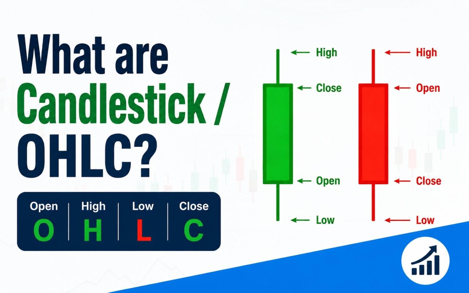
OHLC is an acronym for the four core price points recorded during a specific timeframe (whether that’s 1 minute, 1 hour, 1 day, or 1 week):
- Open: The price of the asset when the trading period began.
- High: The highest price the asset reached during the period.
- Low: The lowest price the asset reached during the period.
- Close: The final price of the asset when the trading period ended.
Anatomy of a Candlestick
While standard OHLC bar charts show this data using simple side pegs, Japanese Candlestick charts present the exact same four metrics in a much more visual, intuitive format.
A single candlestick consists of two main parts:
1. The Real Body
The wide rectangular middle section represents the range between the Open and Close prices.
- Green (or White / Bullish): Indicates price went up. The Close price was higher than the Open price.
- Red (or Black / Bearish): Indicates price went down. The Close price was lower than the Open price.
2. The Wicks (Shadows)
The thin lines extending above and below the body represent price extremes during that timeframe.
- Upper Shadow (Upper Wick): Extends from the top of the body to the High price.
- Lower Shadow (Lower Wick): Extends from the bottom of the body to the Low price.
How to Read a Candlestick: A Simple Example
Imagine a stock over a 1-day timeframe:
| Metric | Price |
| Open | $100 |
| High | $110 |
| Low | $95 |
| Close | $108 |
- Because the stock closed higher than it opened ($108 vs. $100), the candlestick body will be green.
- The bottom of the green body sits at $100 (Open), and the top of the green body sits at $108 (Close).
- The upper wick reaches up to $110 (High), showing buyers pushed price up, but couldn’t keep it there.
- The lower wick drops down to $95 (Low), showing sellers tried to push price down earlier in the day.
What Candlesticks Reveal About Market Sentiment
Beyond showing price numbers, candlesticks illustrate the battle between buyers (bulls) and sellers (bears).
Key Takeaway:
- Long Green Bodies mean strong buying pressure—buyers were in control almost the entire period.
- Long Red Bodies mean strong selling pressure—sellers drove prices down aggressively.
- Long Upper Wicks mean buyers pushed hard, but sellers rejected the higher prices and forced the market back down.
- Long Lower Wicks mean sellers dumped prices, but buyers stepped in heavy at lower levels to push prices back up.
Summary Comparison: Standard Bar Chart vs. Candlestick Chart
| Feature | Standard OHLC Bar Chart | Candlestick Chart |
| Visual Style | Vertical lines with small left/right ticks | Filled rectangular bodies with top/bottom wicks |
| Ease of Reading | Harder to spot trends instantly | Color coding makes momentum obvious immediately |
| Information | Shows Open, High, Low, Close | Shows Open, High, Low, Close |
| Popularity | Popular with traditional institution traders | Universal industry standard for modern traders |