The 7 Essential Types of Charts
1. Comparison Charts
Used to compare values across discrete categories or show rank.
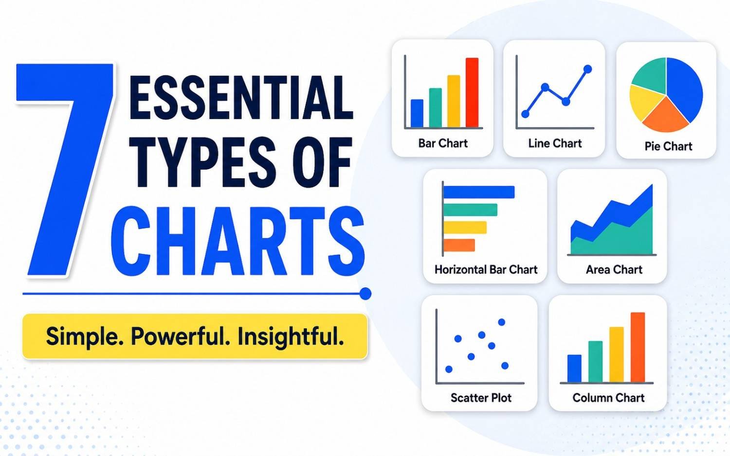
- Bar / Column Charts: The workhorses of data visualization. Vertical column charts work best for time-based series, while horizontal bar charts excel when category labels are long or numerous.
- Grouped & Stacked Bars: Useful for breaking down main categories into sub-groups to show relative contributions.
2. Time-Series & Trend Charts
Designed to reveal movement, progression, or patterns over continuous time intervals.
- Line Charts: The gold standard for displaying continuous trends over days, months, or years.
- Area Charts: Similar to line charts, but with the space below the line filled, emphasizing the total volume or magnitude over time.
3. Composition & Part-to-Whole Charts
Show how individual components make up a total share (usually totaling 100%).
- Pie & Donut Charts: Best restricted to 2–5 distinct categories with significantly different proportions.
- Treemaps: A nested structure of rectangles ideal for showing hierarchical data and large part-to-whole datasets.
- Stacked 100% Bar Charts: Great for comparing composition across multiple groups side-by-side.
4. Distribution Charts
Illustrate how data points are spread out, showing frequency, central tendency, and outliers.
- Histograms: Look like column charts, but measure frequency within continuous quantitative bins rather than discrete categories.
- Box Plots (Box-and-Whisker): Summarize large datasets using five key metrics: minimum, first quartile, median, third quartile, and maximum.
5. Relationship & Correlation Charts
Highlight connections, correlations, or interactions between two or more variables.
- Scatter Plots: Map individual data points along two axes to reveal correlation strength and outliers.
- Bubble Charts: Extend scatter plots by using the size (and sometimes color) of the bubble to encode a third or fourth variable.
6. Spatial & Map Charts
Geographical visualizations used when location is a primary dimension of the data.
- Choropleth Maps: Color-code geographical areas (countries, states, zip codes) based on a specific metric.
- Proportional Symbol Maps: Overlay dots or symbols onto a map, scaling their size to match data values.
7. Process & Flow Charts
Track movement, funnels, or operational progression through defined steps.
- Sankey Diagrams: Depict flow quantities between nodes in a network, where line thickness matches flow volume.
- Funnel Charts: Track drop-off rates across sequential stages, common in sales and user conversion tracking.
At a Glance: Choosing the Right Chart
| Goal | Best Chart Options | What to Avoid |
| Compare categories | Bar Chart, Column Chart | Pie charts with 10+ slices |
| Track continuous trends | Line Chart, Area Chart | Discrete bar charts with dozens of dates |
| Show 100% breakdown | Donut Chart, Stacked Bar, Treemap | 3D pie charts |
| Find correlation | Scatter Plot, Bubble Chart | Line charts with unsorted axes |
| Show customer drop-off | Funnel Chart, Sankey Diagram | Standard pie charts |
3 Quick Rules for High-Impact Charts
1. Keep your baseline at zero: Truncating the Y-axis on bar charts distorts relative sizes and misleads readers.
2. Limit categories: If a pie chart has more than 5 slices, group smaller values into an “Other” category or switch to a bar chart.
3. Design for scanning: Use contrasting colors to highlight key data points rather than rainbow palettes that distract from the message.