
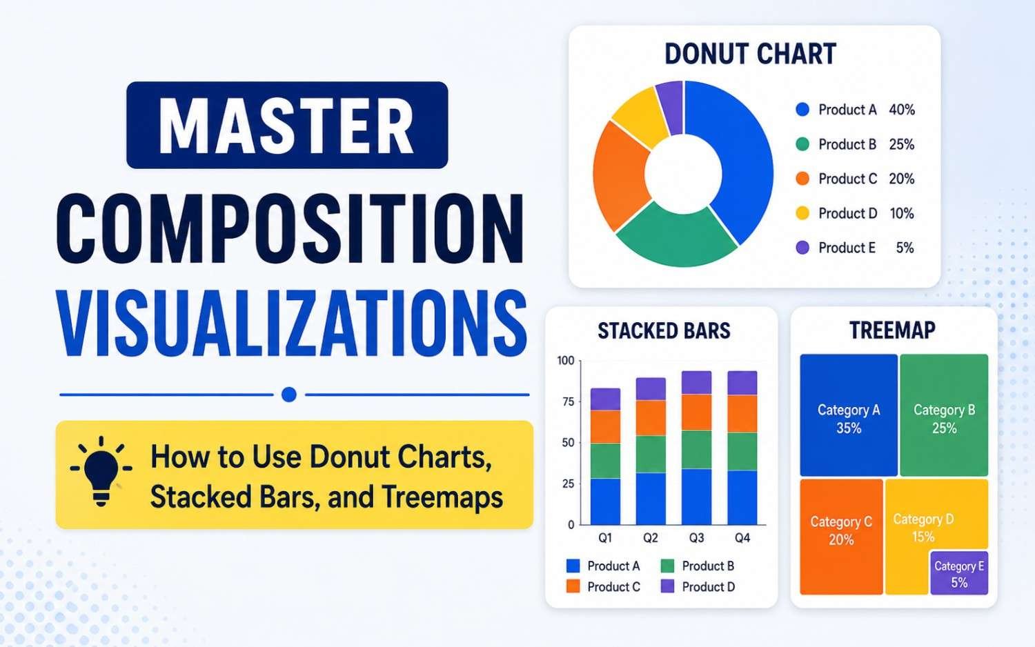
Understanding how individual parts make up a whole is one of the most common challenges in business analytics and data storytelling. Whether you are illustrating market share, budget allocations, or product revenue breakdowns, composition charts answer a fundamental question: “What is this total made of?”
While pie charts traditionally dominate this space, three superior alternatives offer better readability, scalability, and visual clarity: Donut Charts, Stacked Bar Charts, and Treemaps.
1. Donut Charts: Modern, Clean Part-to-Whole Summaries
A Donut Chart is functionally identical to a pie chart, but with a hollow center cut out. That hollow space isn’t just an aesthetic upgrade—it changes how your brain processes the data.
Why Use a Donut Chart Instead of a Pie Chart?
- Easier Angle Perception: Humans struggle to accurately gauge angles in solid pie slices. Opening the center forces the viewer’s eye to judge arc length instead, which is far easier to compare.
- KPI Centerpiece: The empty center provides high-value real estate to highlight the overall total value, a summary percentage, or a clear label.
Best Used For:
- Displaying 2 to 5 distinct categories max.
- Simple percentage breakdowns (e.g., Device Type: Mobile vs. Desktop vs. Tablet).
Pro Tip: If your Donut Chart has more than 5 slices, the arc lengths become too short to judge accurately. Group smaller categories into an “Other” segment or switch to a bar format.
2. Stacked Bar Charts: Precise Multi-Group Comparisons
Stacked Bar Charts take the part-to-whole concept and arrange it linearly along a bar. They come in two primary variations:
- Absolute Value Stacked Bars: Shows total volume alongside category sub-totals.
- 100% Stacked Bars: Normalizes every bar to 100% to compare proportional compositions side-by-side.
Key Strengths:
- Space-Efficient: You can compare the composition of multiple groups side-by-side along a single timeline or set of categories—something impossible with donut charts.
- Linear Precision: Judging segment lengths along a straight bar is cognitively easier than evaluating curved arcs or pie slices.
Best Used For:
- Comparing compositions across time or segments (e.g., Quarterly Revenue Breakdown by Region).
- Showing survey results using Likert scales (Strongly Agree down to Strongly Disagree).
| Stacked Bar Variant | Primary Advantage | Main Drawback |
| Absolute Stacked Bar | Displays overall growth/volume and sub-category splits together. | Middle and top segments lose a shared baseline, making them harder to compare precisely. |
| 100% Stacked Bar | Excellent for comparing pure proportions across varying sample sizes. | Hides absolute magnitude (e.g., a group of 10 looks the same size as a group of 10,000). |
3. Treemaps: Visualizing Large & Hierarchical Datasets
When your dataset expands to dozens of categories—or contains nested sub-categories—donut and stacked bar charts collapse under the weight of visual clutter. This is where Treemaps shine.
A Treemap displays data as a set of nested rectangles. The area of each rectangle is directly proportional to the data value it represents.
Key Strengths:
- High Data Density: Displays hundreds of data points cleanly within a single compact frame.
- Hierarchical Depth: Effortlessly shows nested relationships (e.g., Department → Team → Individual Project).
- Color as a Second Dimension: You can use rectangle size for volume (e.g., Revenue) and rectangle color for a secondary metric (e.g., Year-over-Year Growth Rate).
Best Used For:
- Large product catalogs, portfolio allocations, or budget allocations.
- Disk space analyzers, stock market heatmaps, and file system breakdowns.
Decision Matrix: Which Chart Should You Use?
Choosing the right composition chart comes down to three factors: the number of categories, the presence of sub-groups, and whether you are comparing multiple totals.
| Feature / Need | Donut Chart | Stacked Bar | Treemap |
| Number of Categories | 2 – 5 | 2 – 6 per bar | 10 to 100+ |
| Hierarchical / Nested Data | ❌ No | ❌ No | Yes |
| Multiple Groups Side-by-Side | ❌ No | Yes | ❌ No |
| Center KPI / Callout Space | Yes | ❌ No | ❌ No |
| Displays Secondary Metric (Color) | ❌ No | ❌ No | Yes |
3 Golden Rules for Better Composition Charts
1. Order Segments Deliberately
Always sort your categories by size—largest to smallest—starting from the 12 o’clock position on a donut chart, or from the baseline on a stacked bar chart. Random sorting forces the reader’s eyes to jump around.
2. Limit Your Color Palette
Using a rainbow of distinct colors creates cognitive fatigue. Instead, use shades of a single color family for sub-categories, or reserve a bold accent color exclusively for the segment you want your audience to focus on.
3. Don’t Force 100% Breakdown on Unrelated Data
Composition charts inherently signal to the viewer that all parts sum to a meaningful total (100%). If your categories overlap or do not represent a complete whole, use a standard horizontal bar chart instead.