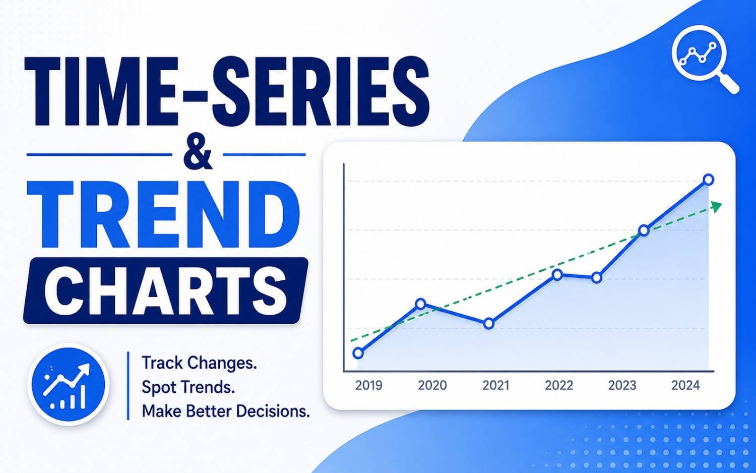
Whether you are tracking quarterly revenue, server uptime, daily website traffic, or global temperature shifts, continuous data needs a story. That story is defined by time.
Time-series and trend charts are designed to reveal patterns, seasonality, cycles, and directional momentum across continuous time intervals. When constructed correctly, they turn historical records into actionable forecasts.
What is a Time-Series Chart?
A time-series chart plots data points in chronological order along a continuous timeline.
- The X-Axis (Horizontal): Always represents time (hours, days, months, years).
- The Y-Axis (Vertical): Represents the quantitative metric being measured (revenue, temperature, percentage, user count).
Unlike simple comparison charts that group discrete categories (like products or departments), time-series charts emphasize continuity and progression.
The 4 Primary Types of Trend Visualizations
While there are many niche variations, four core chart types handle the vast majority of time-based data.
1. Line Charts: The Gold Standard
Line charts connect individual data points with a line, making them the most effective visualization for displaying continuous trends over time.
- Best For: Tracking single or multiple metrics over medium-to-long time horizons.
- When to Use: Monitoring stock prices, monthly active users, or daily temperatures.
- Pro Tip: Keep multi-line charts to 4 or fewer lines. Any more creates an unreadable “spaghetti chart.”
2. Area Charts: Visualizing Total Volume
An area chart is essentially a line chart with the space beneath the line filled with color or shading.
- Best For: Emphasizing the total volume or cumulative magnitude alongside the trend line.
- When to Use: Tracking total energy consumption, cumulative sales revenue, or continuous traffic volume.
- Caution: Avoid layering multiple opaque area charts, as upper layers will hide lower ones. Use subtle transparency or stacked variants instead.
3. Stacked Area Charts: Part-to-Whole Over Time
Stacked area charts demonstrate how individual sub-categories contribute to a changing total over time.
- Best For: Showing compositional shifts across continuous time periods.
- When to Use: Displaying total company revenue broken down by product category over 5 years.
- Key Limitation: Only the bottom-most category shares a flat baseline, making middle and top layers harder to evaluate individually.
4. Candlestick & OHLC Charts: High-Density Financial Trends
Common in financial trading, Open-High-Low-Close (OHLC) and Candlestick charts pack four data points into every time interval.
- Best For: Analyzing market volatility, trading ranges, and price movements over fixed time blocks (e.g., 15-minute intervals or daily closes).
- When to Use: Stock, crypto, or commodity price monitoring.
Choosing the Right Time-Series Chart
| Goal | Recommended Chart | Key Advantage |
| Track continuous trend over time | Line Chart | Clean, easy to read, supports multiple series |
| Emphasize total cumulative volume | Area Chart | Highlights magnitude and filled space |
| Show compositional breakdown over time | Stacked Area Chart | Illustrates part-to-whole shifts |
| Analyze financial price volatility | Candlestick / OHLC | Shows high, low, open, and close in one frame |
4 Best Practices for High-Impact Trend Visualizations
1. Keep Time Moving Left-to-Right
Human cognition overwhelmingly expects time to progress horizontally from left to right. Never rotate a time axis vertically.
2. Maintain Consistent Time Intervals
Ensure your X-axis increments are uniform (e.g., daily, weekly, or monthly). Mixing intervals distorts slopes and misrepresents trends.
3. Handle Missing Data Explicitly
If data was not collected on a specific date, do not draw a smooth line through it without indicating the gap. Either break the line or use a dashed segment to signal missing points.
4. Be Cautious with Dual Y-Axes
Plotting two metrics with different units on left and right Y-axes often misleads viewers about correlation. When possible, use two stacked mini-charts instead.